
Key Takeaways
- Build website flows around clear visitor goals, not internal business structures.
- Make each next step obvious with simple navigation and descriptive links.
- Reduce friction by simplifying forms, preserving user input, and showing progress.
- Design flows for accessibility, mobile use, and strong performance.
- Test real tasks regularly and fix the biggest barriers first.
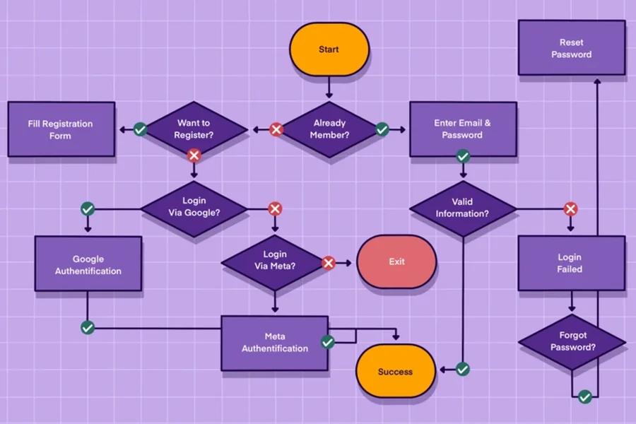
A website user flow is the path someone takes to complete a task, from their first visit through a meaningful outcome. Strong flows connect pages, decisions, actions, and feedback so visitors do not have to guess where to go next. Reviewing examples of use cases designs can help teams see how clear page sections support different visitor needs without overwhelming the experience.
A polished homepage is not enough if the next step is unclear. A visitor may understand your offer but leave if they cannot find pricing, compare options, request help, or complete a form with confidence. Better user flows put the visitor’s goal ahead of the company’s internal structure.
Why User Flows Matter
User flows reveal whether a site helps people move forward or creates unnecessary work. For example, a visitor who arrives on a service page should be able to understand the service, evaluate whether it fits their needs, contact the business, and receive confirmation. If they must return to the homepage to find each step, the flow is doing the hard work for them.
Start With User Goals
Begin with what visitors need to accomplish, not with a list of pages the team wants to publish. Identify your main audiences and give each one a clear goal, such as comparing plans, booking a consultation, making a purchase, finding support, or creating an account. Then note the information, concerns, and proof each person needs before taking action.
- Define one primary goal for each audience.
- List the questions that could delay action.
- Choose the most useful next step for that goal.
Map The Main Path
Turn each goal into the shortest realistic route. Start with an entry point, a first useful action, a decision point, the main task, and a confirmation message. A simple service flow might look like this: Search result → Service page → Pricing details → Contact form → Confirmation. The exact route can change by traffic source, device, audience, or level of intent, but the outcome should remain clear.
Make Navigation Easy To Follow
Navigation should help visitors stay oriented without becoming a directory of every page. Use familiar labels, group related destinations, and keep the main menu focused on high-value tasks. Descriptive links such as “View pricing” or “Schedule a consultation” set expectations better than “Learn more.” Breadcrumbs can help on large sites, while consistent desktop and mobile patterns reduce relearning. Avoid vague labels, deeply hidden menus, and pages that leave people with no clear next step.
Design For Common Website Use Cases
Research And Comparison
Visitors comparing options need a clear summary before the details. Show meaningful differences in features, pricing, suitability, and limitations. Place testimonials, FAQs, and practical proof close to the decision rather than burying them on a separate page.
Lead Generation
Explain why the form is worth completing and what happens afterward. Ask only for information needed at that stage, label every field clearly, and provide specific error messages. A request form that asks for a budget, job title, phone number, company size, and detailed project brief before explaining the value creates hesitation. A shorter form with a clear response timeframe often creates a better path.
Purchasing Or Booking
Show costs, availability, requirements, and delivery expectations early. Keep the number of steps visible, allow people to review details before submitting, and make it easy to correct an error without starting over.
Account Creation And Support
Make the value of creating an account obvious, provide a visible password recovery route, and guide new users toward their first useful action. For support, make search easy to find, organize articles around real problems, and offer a clear contact option when self-service does not solve the issue.
Reduce Friction At Key Steps
Friction often appears at forms, account walls, checkout screens, and confirmation pages. Remove repeated questions, preserve entered information after an error, show progress in longer processes, and use plain-language button labels. Keep important information visible while people decide. “Submit” is less helpful than “Request my consultation” when the button can clearly describe the outcome.
Build Accessibility Into The Flow
Accessibility encompasses the entire user journey, not just individual pages. Make sure all key actions are keyboard-accessible, focus states are visible, labels are clear, and errors or statuses are indicated beyond color. Using semantic HTML, predictable interactions, support for reduced motion, and clear confirmation messages benefits screen reader users while also improving usability for mobile users, older adults, and those in noisy or distracting settings.
Improve Speed And Mobile Use
Performance affects the flow before a visitor reads a headline. Test the first page people actually land on, compress oversized images, remove unnecessary scripts, and keep key content near the top of small screens. Large touch targets and stable layouts reduce accidental taps. Reviewing loading, responsiveness, and visual stability together helps teams identify performance problems that interrupt a task.
Test And Refine The Journey
Test real tasks instead of judging pages in isolation. Ask someone unfamiliar with the site to complete one high-priority action, then observe where they pause, backtrack, or ask questions. Combine those observations with completion rates, form errors, site searches, exits, session recordings, and support requests. Test on phones and with keyboard-only navigation, fix the largest barrier first, then repeat.
Website Flow Review Checklist
- Can visitors quickly understand the page and its main action?
- Does every page lead naturally to a useful next step?
- Are costs, requirements, and timeframes easy to find?
- Can people recover from mistakes without losing their work?
- Does the task work well on a phone and with a keyboard?
- Does the confirmation explain what happens next?
Conclusion
Better website user flows are clear, focused, accessible, and continuously tested. Start with one important visitor goal, remove avoidable obstacles, and make the next step obvious. The strongest websites do not add screens for their own sake. They help people reach the right outcome with less effort.
